In Part 1 of this series, we set up a basic HTML 5 project using Netbeans as our IDE, and we also presented a few elements that have been added in this new specification of the language.
[ You might also like: 27 Best IDEs for C/C++ Programming or Source Code Editors on Linux ]
In a few words, you can think of jQuery as a cross-browser and cross-platform Javascript library that can greatly simplify client-side scripting in HTML pages. On the other hand, Bootstrap can be described as a complete framework that integrates HTML, CSS, and Javascript tools to create mobile-friendly and responsive web pages.
In this article, we will introduce you to jQuery and Bootstrap, two priceless utilities to write HTML 5 code more easily. Both jQuery and Bootstrap are licensed under the MIT and Apache 2.0 licenses, which are compatible with the GPL and are thus free software.
Please note that basic HTML, CSS, and Javascript concepts are not covered in any article of this series. If you feel you need to get up to speed with these topics first before proceeding, I highly recommend the HTML 5 tutorial in W3Schools.
Incorporating jQuery and Bootstrap into Our Project
To download jQuery, go to the project’s website at http://jquery.com and click on the button that displays the notice for the latest stable version.
We will go with this second option in this guide. DO NOT click on the download link yet. You will notice that you can download either a compressed .min.js or an uncompressed .js version of jQuery.
The first is meant specially for websites and helps reduce the load time of pages (and thus Google will rank your site better), while the second is targeted mostly at coders for development purposes.
For the sake of brevity and easiness of use, we will download the compressed (also known as minified) version to the scripts folder inside our site structure.
$ cd /home/ubuntu/NetBeansProjects/TecmintTest/public_html/scripts/
$ wget https://code.jquery.com/jquery-3.6.0.min.js

Now it’s time to add Bootstrap to our project. Go to http://getbootstrap.com and click on Download Bootstrap. On the next page, click on the highlighted option as indicated below to download the minified components, ready to use, in a zip file:

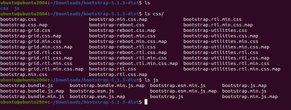
When the download completes, go to your Downloads folder, unzip the file, and copy the highlighted files to the indicated directories inside your project:
# cd ~/Downloads
# unzip -a bootstrap-5.1.3-dist.zip
# cd bootstrap-5.1.3-dist/

Now copy CSS and JS files to respective folders in the project structure.
# cp css/bootstrap.min.css /home/ubuntu/NetBeansProjects/TecmintTest/public_html/styles
# cp js/bootstrap.min.js /home/ubuntu/NetBeansProjects/TecmintTest/public_html/scripts
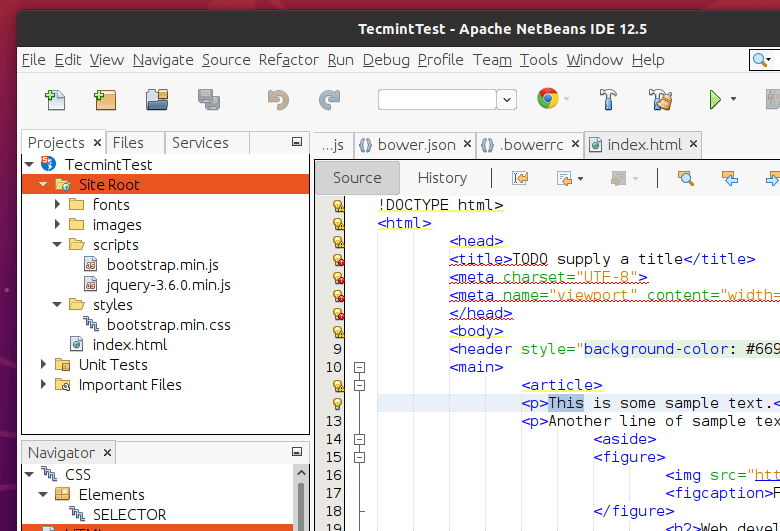
If you now expand the structure of your site in Netbeans, it should look as follows:

Adding References
That sure looks good, but we still haven’t told our index.html file to use any of those files. For the sake of simplicity, we will replace the contents of that file with a barebones html file first:
<!DOCTYPE html>
<html>
<head>
	<meta charset="utf-8">
	<title>jQuery and Bootstrap</title>
</head>
<body>

   <!-- // Your code will appear here. -->

</body>
</html>
Then, just drag and drop each file from the project navigator section to the code, inside the </head> tags, as you can see in the following screencast. Make sure that the reference to jQuery appears before the reference to Bootstrap because the latter depends on the former:
That’s it – you have added the references to both jQuery and Bootstrap, and can now start writing code.
Writing Your First Responsive Code
Let’s now add a navigation bar and place it at the top of our page. Feel free to include 4-5 links with dummy text and don’t link it to any document for the time being – just insert the following code snippet inside the body of the document.
Don’t forget to spend some time becoming acquainted with the auto-completion feature in Netbeans, which will show you the classes made available by Bootstrap as you start typing.
At the heart of the code snippet below is the Bootstrap container class, which is used to place content inside of a horizontal container that will automatically resize depending on the size of the screen where it is being viewed. No less important is the container-fluid class, which will ensure that the content within will occupy the entire width of the screen.
<div class="container">
  	<nav class="navbar navbar-default">
    	<div class="container-fluid">
      	<div class="navbar-header">
        	<button type="button" class="navbar-toggle collapsed" data-toggle="collapse" data-target="#navbar" aria-expanded="false" aria-controls="navbar">
          	<span class="sr-only">Toggle navigation</span>
          	<span class="icon-bar"></span>
          	<span class="icon-bar"></span>
          	<span class="icon-bar"></span>
        	</button>
        	<a class="navbar-brand" href="#">Project name</a>
      	</div>
      	<div id="navbar" class="navbar-collapse collapse">
        	<ul class="nav navbar-nav">
          	<li class="active"><a href="#">Home</a></li>
          	<li><a href="#">About</a></li>
          	<li><a href="#">Contact</a></li>
          	<li class="dropdown">
            	<a href="#" class="dropdown-toggle" data-toggle="dropdown" role="button" aria-haspopup="true" aria-expanded="false">Dropdown <span class="caret"></span></a>
            	<ul class="dropdown-menu">
              	<li><a href="#">Action</a></li>
              	<li><a href="#">Another action</a></li>
              	<li><a href="#">Something else here</a></li>
              	<li role="separator" class="divider"></li>
              	<li class="dropdown-header">Nav header</li>
              	<li><a href="#">Separated link</a></li>
              	<li><a href="#">One more separated link</a></li>
            	</ul>
          	</li>
        	</ul>
      	</div><!--/.nav-collapse -->
    	</div><!--/.container-fluid -->
  	</nav>
</div>
Another distinguishing feature of Bootstrap is that it eliminates the need for tables in HTML code. Instead, it uses a grid system to layout content and makes it look properly both on large and small devices (from phones all the way to the big desktop or laptop screens).
In Bootstrap’s grid system, the screen layout is divided into 12 columns:

A typical setup consists of using the 12-column layout divided into 3 groups of 4 columns each, as follows:

To indicate this fact in code, and in order to have it displayed that way starting in medium-size devices (such as laptops) and above, add the following code below the closing </nav> tag:
...
    </nav>
   	 <div class="row">
   	 	<div class="col-md-4">This is the text in GROUP 1</div>
   	 	<div class="col-md-4">This is the text in GROUP 2</div>
   	 	<div class="col-md-4">This is the text in GROUP 3</div>
   	 </div>
</div> <!--Closing tag of the container class -->
You must have probably noticed that the column classes in the Bootstrap grid indicate the starting layout for specific device size and above, as md in this example stands for medium (which also covers lg, or large devices).
For smaller devices (sm and xs), the content divs get stacked and appear one above the next.
In the following screencast, you can see how your page should look by now. Note that you can resize your browser’s window to simulate different screen sizes after launching the project using the Run project button as we learned in Part 1.
Summary
Congratulations! You must have written a simple, yet functional, responsive page by now. Don’t forget to check the Bootstrap website in order to become more familiar with the almost limitless functionality of this framework.
As always, in case you have a question or comment, feel free to contact us using the form below.
